City flags: What is good design?
Keep your city’s flag design simple, says the North American Vexillological Association (NAVA). Members of NAVA are interested in all aspects of flags. The flag’s appearance should be basic and plain to the point that a child can draw it from memory, say NAVA experts. The image to the right shows NAVA’s official flag. 
Vexillology is the scientific study of the history, symbolism and usage of flags or, by extension, any interest in flags in general. The word is a synthesis of the Latin word vexillum (“flag”) and the Greek suffix -logia (“study.”)
John Hartvigsen, president of NAVA, has designed flags, including flags for NAVA annual meetings, as well as his own personal flag. He worked with the Utah state legislature in 2011 in correcting the design of the Utah state flag and returned the flag to its original colors from 1913. “With the help of others, we gained passage of two legislative measures to accomplish the corrected design while honoring the history of the state flag,” Hartvigsen tells GPN.
Hartvigsen urges city officials and others interested in appropriate flag representation and arrangement to check out the flag design section of NAVA’s website. He also recommends that they take a look at to two of NAVA’s publications, “American City Flags” and “Canadian City Flags,” that are available from NAVA in print and online. “These publications include color illustrations, descriptions and histories of the city flags used by many U.S. and Canadian cities. These flags can be reviewed to see what other cities have adopted for their flags,” Hartvigsen tells GPN. Go here for information on NAVA publications, including “Good Flag, Bad Flag: How to Design a Great Flag.”
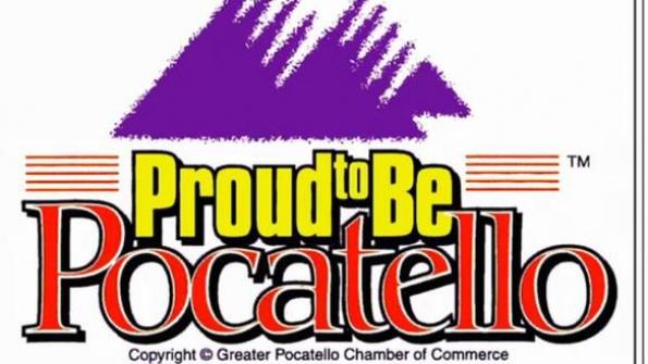
A recent TED Conference presentation by Roman Mars outlined how Pocatello, Idaho, is upgrading the city’s flag design. Mars is the host and producer of 99% Invisible, a KALW-San Francisco radio show and podcast about design and architecture. The presentation spotlighted both good and ineffective design strategies.
Based on a NAVA survey of 150 city flags, Pocatello’s flag scored lowest: 1.48. The city’s current flag, which features a variety of fonts plus trademark and copyright symbols, misses the mark in good flag design, NAVA experts say.


