Revamped website reflects reshaped community in San Marcos, Calif.
A ten-year population boom and changing demographics in San Marcos, located in northern San Diego County, Calif., led city leaders to refresh their brand to better reflect a reshaped city.
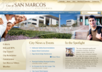
Prior to the shift, the city’s website had an outdated design and a decentralized, inconsistent approach to content management. San Marcos Communications Officer Sarah Macdonald says the city’s problem was a result of “an information explosion” on the city’s website. Some areas were current and others hadn’t been touched in years.
“We needed a site redesign not only to refresh our look and feel, but also to get our content back under control,” Macdonald says. “Residents expect the same level of innovation from government websites as our corporate counterparts. Our goal was to make it easy for residents to connect with services and programs, and provide visitors and businesses with an instant impression of what San Marcos is all about. In the end, we reinvented our main navigation, reorganized and reduced more than 10,000 pages of content to 383 pages.”  To the right: A screenshot of the city’s website prior to its redesign.
After a competitive selection process, which included evaluations of product functionality, sustainability, vendor experience and training expertise, San Marcos chose El Segundo, Calif.-based Vision to develop its new site. The redesigned website went live in February 2016.
“We needed a user-friendly content management system and Vision’s CMS was far more advanced than the other top candidates,” Macdonald says. “Also, the visionLive maintenance subscription program was a huge plus, because it ensures that our new site will stay relevant and on the cutting edge.”
According to Macdonald, Vision brought value at the very start of the website development process. “Vision’s data-driven approach helped us figure out how the site could function better for residents and businesses, and gave us the information we needed for the foundation of our new website.”
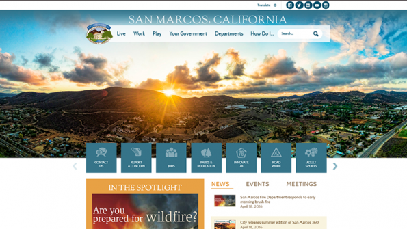
San Marcos is a place where people “Live, Work and Play,” which is how the site, www.san-marcos.net is now structured. The new design puts the most popular items up front, making the site easy to navigate. Research showed that people were most interested in jobs and parks and recreation. They also wanted to “report a concern” online as well as an adult sports page. The revamped website is the hub of an “ENGAGE San Marcos” communications campaign designed to increase communication and interaction with residents.
One feature of the new site is its responsive design. San Marcos has an icon-oriented design that displays well on mobile devices. A line of icons in the top right corner of each page allows site visitors to choose a globe icon that can translate website copy into any of more than 100 languages or link to the city’s five social media channels.
According to Macdonald, monthly visits to the new site jumped to 23,000 with 96,000 page views from an average of 10,000 per month with 26,000 page views on the old site. Online visitors are invited to provide feedback on the new look by completing a short survey. The survey showed that 90 percent of site visitors (a 22 percent increase) now report the site as easy to navigate.
San Marcos views its website as a fluid portal. Macdonald says the website content review team will continue to drill down into the site’s content, and already has identified areas for improvement, including plans to increase online service delivery.
Go here for more information on Vision.


